3. Business Cycles
3.1Overview
In this lecture we review some empirical aspects of business cycles.
Business cycles are fluctuations in economic activity over time.
These include expansions (also called booms) and contractions (also called recessions).
For our study, we will use economic indicators from the World Bank and FRED.
In addition to the packages already installed by Anaconda, this lecture requires
!pip install wbgapi
!pip install pandas-datareader
Output
Collecting wbgapi
Using cached wbgapi-1.0.12-py3-none-any.whl.metadata (13 kB)
Requirement already satisfied: requests in /opt/hostedtoolcache/Python/3.12.9/x64/lib/python3.12/site-packages (from wbgapi) (2.32.3)
Requirement already satisfied: PyYAML in /opt/hostedtoolcache/Python/3.12.9/x64/lib/python3.12/site-packages (from wbgapi) (6.0.2)
Collecting tabulate (from wbgapi)
  Using cached tabulate-0.9.0-py3-none-any.whl.metadata (34 kB)
Requirement already satisfied: charset-normalizer<4,>=2 in /opt/hostedtoolcache/Python/3.12.9/x64/lib/python3.12/site-packages (from requests->wbgapi) (3.4.1)
Requirement already satisfied: idna<4,>=2.5 in /opt/hostedtoolcache/Python/3.12.9/x64/lib/python3.12/site-packages (from requests->wbgapi) (3.10)
Requirement already satisfied: urllib3<3,>=1.21.1 in /opt/hostedtoolcache/Python/3.12.9/x64/lib/python3.12/site-packages (from requests->wbgapi) (2.3.0)
Requirement already satisfied: certifi>=2017.4.17 in /opt/hostedtoolcache/Python/3.12.9/x64/lib/python3.12/site-packages (from requests->wbgapi) (2025.1.31)
Using cached wbgapi-1.0.12-py3-none-any.whl (36 kB)
Using cached tabulate-0.9.0-py3-none-any.whl (35 kB)
Installing collected packages: tabulate, wbgapi
Successfully installed tabulate-0.9.0 wbgapi-1.0.12
Requirement already satisfied: pandas-datareader in /opt/hostedtoolcache/Python/3.12.9/x64/lib/python3.12/site-packages (0.10.0)
Requirement already satisfied: lxml in /opt/hostedtoolcache/Python/3.12.9/x64/lib/python3.12/site-packages (from pandas-datareader) (5.3.1)
Requirement already satisfied: pandas>=0.23 in /opt/hostedtoolcache/Python/3.12.9/x64/lib/python3.12/site-packages (from pandas-datareader) (2.2.3)
Requirement already satisfied: requests>=2.19.0 in /opt/hostedtoolcache/Python/3.12.9/x64/lib/python3.12/site-packages (from pandas-datareader) (2.32.3)
Requirement already satisfied: numpy>=1.26.0 in /opt/hostedtoolcache/Python/3.12.9/x64/lib/python3.12/site-packages (from pandas>=0.23->pandas-datareader) (2.1.3)
Requirement already satisfied: python-dateutil>=2.8.2 in /opt/hostedtoolcache/Python/3.12.9/x64/lib/python3.12/site-packages (from pandas>=0.23->pandas-datareader) (2.9.0.post0)
Requirement already satisfied: pytz>=2020.1 in /opt/hostedtoolcache/Python/3.12.9/x64/lib/python3.12/site-packages (from pandas>=0.23->pandas-datareader) (2025.1)
Requirement already satisfied: tzdata>=2022.7 in /opt/hostedtoolcache/Python/3.12.9/x64/lib/python3.12/site-packages (from pandas>=0.23->pandas-datareader) (2025.1)
Requirement already satisfied: charset-normalizer<4,>=2 in /opt/hostedtoolcache/Python/3.12.9/x64/lib/python3.12/site-packages (from requests>=2.19.0->pandas-datareader) (3.4.1)
Requirement already satisfied: idna<4,>=2.5 in /opt/hostedtoolcache/Python/3.12.9/x64/lib/python3.12/site-packages (from requests>=2.19.0->pandas-datareader) (3.10)
Requirement already satisfied: urllib3<3,>=1.21.1 in /opt/hostedtoolcache/Python/3.12.9/x64/lib/python3.12/site-packages (from requests>=2.19.0->pandas-datareader) (2.3.0)
Requirement already satisfied: certifi>=2017.4.17 in /opt/hostedtoolcache/Python/3.12.9/x64/lib/python3.12/site-packages (from requests>=2.19.0->pandas-datareader) (2025.1.31)
Requirement already satisfied: six>=1.5 in /opt/hostedtoolcache/Python/3.12.9/x64/lib/python3.12/site-packages (from python-dateutil>=2.8.2->pandas>=0.23->pandas-datareader) (1.17.0)
We use the following imports
import matplotlib.pyplot as plt
import pandas as pd
import datetime
import wbgapi as wb
import pandas_datareader.data as web
Here’s some minor code to help with colors in our plots.
Source
# Set graphical parameters
cycler = plt.cycler(linestyle=['-', '-.', '--', ':'],
        color=['#377eb8', '#ff7f00', '#4daf4a', '#ff334f'])
plt.rc('axes', prop_cycle=cycler)3.2Data acquisition
We will use the World Bank’s data API wbgapi and pandas_datareader to retrieve data.
We can use wb.series.info with the argument q to query available data from
the World Bank.
For example, let’s retrieve the GDP growth data ID to query GDP growth data.
wb.series.info(q='GDP growth')Now we use this series ID to obtain the data.
gdp_growth = wb.data.DataFrame('NY.GDP.MKTP.KD.ZG',
            ['USA', 'ARG', 'GBR', 'GRC', 'JPN'],
            labels=True)
gdp_growthWe can look at the series’ metadata to learn more about the series (click to expand).
wb.series.metadata.get('NY.GDP.MKTP.KD.ZG')Output
3.3GDP growth rate
First we look at GDP growth.
Let’s source our data from the World Bank and clean it.
# Use the series ID retrieved before
gdp_growth = wb.data.DataFrame('NY.GDP.MKTP.KD.ZG',
            ['USA', 'ARG', 'GBR', 'GRC', 'JPN'],
            labels=True)
gdp_growth = gdp_growth.set_index('Country')
gdp_growth.columns = gdp_growth.columns.str.replace('YR', '').astype(int)
Here’s a first look at the data
gdp_growthWe write a function to generate plots for individual countries taking into account the recessions.
Source
def plot_series(data, country, ylabel,
                txt_pos, ax, g_params,
                b_params, t_params, ylim=15, baseline=0):
    """
    Plots a time series with recessions highlighted.

    Parameters
    ----------
    data : pd.DataFrame
        Data to plot
    country : str
        Name of the country to plot
    ylabel : str
        Label of the y-axis
    txt_pos : float
        Position of the recession labels
    y_lim : float
        Limit of the y-axis
    ax : matplotlib.axes._subplots.AxesSubplot
        Axes to plot on
    g_params : dict
        Parameters for the line
    b_params : dict
        Parameters for the recession highlights
    t_params : dict
        Parameters for the recession labels
    baseline : float, optional
        Dashed baseline on the plot, by default 0

    Returns
    -------
    ax : matplotlib.axes.Axes
        Axes with the plot.
    """

    ax.plot(data.loc[country], label=country, **g_params)

    # Highlight recessions
    ax.axvspan(1973, 1975, **b_params)
    ax.axvspan(1990, 1992, **b_params)
    ax.axvspan(2007, 2009, **b_params)
    ax.axvspan(2019, 2021, **b_params)
    if ylim != None:
        ax.set_ylim([-ylim, ylim])
    else:
        ylim = ax.get_ylim()[1]
    ax.text(1974, ylim + ylim*txt_pos,
            'Oil Crisis\n(1974)', **t_params)
    ax.text(1991, ylim + ylim*txt_pos,
            '1990s recession\n(1991)', **t_params)
    ax.text(2008, ylim + ylim*txt_pos,
            'GFC\n(2008)', **t_params)
    ax.text(2020, ylim + ylim*txt_pos,
            'Covid-19\n(2020)', **t_params)

    # Add a baseline for reference
    if baseline != None:
        ax.axhline(y=baseline,
                   color='black',
                   linestyle='--')
    ax.set_ylabel(ylabel)
    ax.legend()
    return ax

# Define graphical parameters
g_params = {'alpha': 0.7}
b_params = {'color':'grey', 'alpha': 0.2}
t_params = {'color':'grey', 'fontsize': 9,
            'va':'center', 'ha':'center'}
Let’s start with the United States.
fig, ax = plt.subplots()

country = 'United States'
ylabel = 'GDP growth rate (%)'
plot_series(gdp_growth, country,
            ylabel, 0.1, ax,
            g_params, b_params, t_params)
plt.show()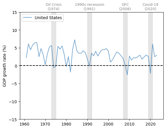
Figure 1:United States (GDP growth rate %)
GDP growth is positive on average and trending slightly downward over time.
We also see fluctuations over GDP growth over time, some of which are quite large.
Let’s look at a few more countries to get a basis for comparison.
The United Kingdom (UK) has a similar pattern to the US, with a slow decline in the growth rate and significant fluctuations.
Notice the very large dip during the Covid-19 pandemic.
fig, ax = plt.subplots()

country = 'United Kingdom'
plot_series(gdp_growth, country,
            ylabel, 0.1, ax,
            g_params, b_params, t_params)
plt.show()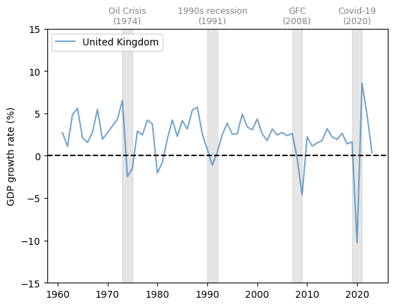
Figure 2:United Kingdom (GDP growth rate %)
Now let’s consider Japan, which experienced rapid growth in the 1960s and 1970s, followed by slowed expansion in the past two decades.
Major dips in the growth rate coincided with the Oil Crisis of the 1970s, the Global Financial Crisis (GFC) and the Covid-19 pandemic.
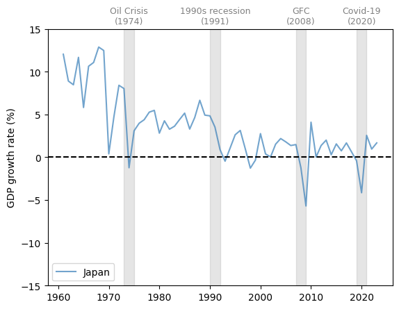
Figure 3:Japan (GDP growth rate %)
Now let’s study Greece.
fig, ax = plt.subplots()

country = 'Greece'
plot_series(gdp_growth, country,
            ylabel, 0.1, ax,
            g_params, b_params, t_params)
plt.show()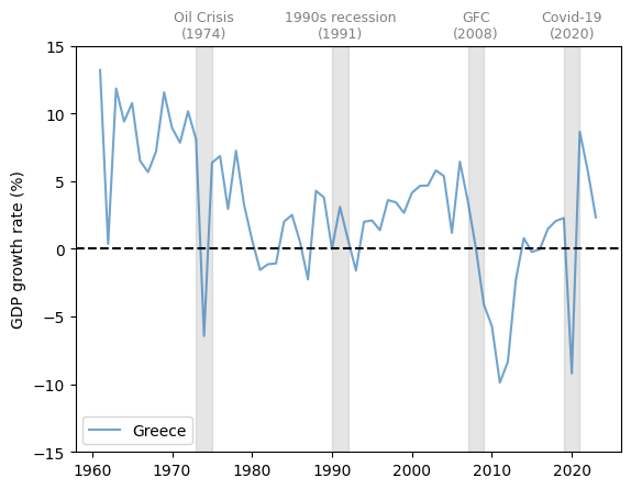
Figure 4:Greece (GDP growth rate %)
Greece experienced a very large drop in GDP growth around 2010-2011, during the peak of the Greek debt crisis.
Next let’s consider Argentina.
fig, ax = plt.subplots()

country = 'Argentina'
plot_series(gdp_growth, country,
            ylabel, 0.1, ax,
            g_params, b_params, t_params)
plt.show()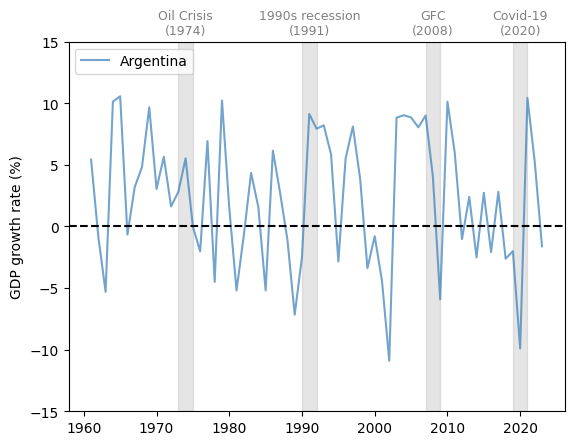
Figure 5:Argentina (GDP growth rate %)
Notice that Argentina has experienced far more volatile cycles than the economies examined above.
At the same time, Argentina’s growth rate did not fall during the two developed economy recessions in the 1970s and 1990s.
3.4Unemployment
Another important measure of business cycles is the unemployment rate.
We study unemployment using rate data from FRED spanning from 1929-1942 to 1948-2022, combined unemployment rate data over 1942-1948 estimated by the Census Bureau.
Source
start_date = datetime.datetime(1929, 1, 1)
end_date = datetime.datetime(1942, 6, 1)

unrate_history = web.DataReader('M0892AUSM156SNBR',
                    'fred', start_date,end_date)
unrate_history.rename(columns={'M0892AUSM156SNBR': 'UNRATE'},
                inplace=True)

start_date = datetime.datetime(1948, 1, 1)
end_date = datetime.datetime(2022, 12, 31)

unrate = web.DataReader('UNRATE', 'fred',
                    start_date, end_date)
Let’s plot the unemployment rate in the US from 1929 to 2022 with recessions defined by the NBER.
Source
# We use the census bureau's estimate for the unemployment rate
# between 1942 and 1948
years = [datetime.datetime(year, 6, 1) for year in range(1942, 1948)]
unrate_census = [4.7, 1.9, 1.2, 1.9, 3.9, 3.9]

unrate_census = {'DATE': years, 'UNRATE': unrate_census}
unrate_census = pd.DataFrame(unrate_census)
unrate_census.set_index('DATE', inplace=True)

# Obtain the NBER-defined recession periods
start_date = datetime.datetime(1929, 1, 1)
end_date = datetime.datetime(2022, 12, 31)

nber = web.DataReader('USREC', 'fred', start_date, end_date)

fig, ax = plt.subplots()

ax.plot(unrate_history, **g_params,
        color='#377eb8',
        linestyle='-', linewidth=2)
ax.plot(unrate_census, **g_params,
        color='black', linestyle='--',
        label='Census estimates', linewidth=2)
ax.plot(unrate, **g_params, color='#377eb8',
        linestyle='-', linewidth=2)

# Draw gray boxes according to NBER recession indicators
ax.fill_between(nber.index, 0, 1,
                where=nber['USREC']==1,
                color='grey', edgecolor='none',
                alpha=0.3,
                transform=ax.get_xaxis_transform(),
                label='NBER recession indicators')
ax.set_ylim([0, ax.get_ylim()[1]])
ax.legend(loc='upper center',
          bbox_to_anchor=(0.5, 1.1),
          ncol=3, fancybox=True, shadow=True)
ax.set_ylabel('unemployment rate (%)')

plt.show()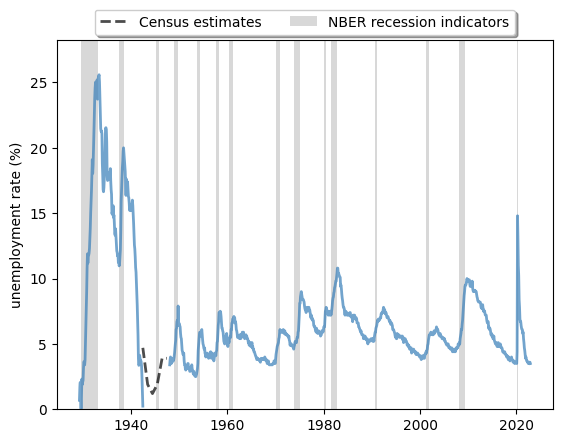
Figure 6:Long-run unemployment rate, US (%)
The plot shows that
- expansions and contractions of the labor market have been highly correlated with recessions.
- cycles are, in general, asymmetric: sharp rises in unemployment are followed by slow recoveries.
It also shows us how unique labor market conditions were in the US during the post-pandemic recovery.
The labor market recovered at an unprecedented rate after the shock in 2020-2021.
3.5Synchronization
In our previous discussion, we found that developed economies have had relatively synchronized periods of recession.
At the same time, this synchronization did not appear in Argentina until the 2000s.
Let’s examine this trend further.
With slight modifications, we can use our previous function to draw a plot that includes multiple countries.
Source
def plot_comparison(data, countries,
                        ylabel, txt_pos, y_lim, ax,
                        g_params, b_params, t_params,
                        baseline=0):
    """
    Plot multiple series on the same graph

    Parameters
    ----------
    data : pd.DataFrame
        Data to plot
    countries : list
        List of countries to plot
    ylabel : str
        Label of the y-axis
    txt_pos : float
        Position of the recession labels
    y_lim : float
        Limit of the y-axis
    ax : matplotlib.axes._subplots.AxesSubplot
        Axes to plot on
    g_params : dict
        Parameters for the lines
    b_params : dict
        Parameters for the recession highlights
    t_params : dict
        Parameters for the recession labels
    baseline : float, optional
        Dashed baseline on the plot, by default 0

    Returns
    -------
    ax : matplotlib.axes.Axes
        Axes with the plot.
    """

    # Allow the function to go through more than one series
    for country in countries:
        ax.plot(data.loc[country], label=country, **g_params)

    # Highlight recessions
    ax.axvspan(1973, 1975, **b_params)
    ax.axvspan(1990, 1992, **b_params)
    ax.axvspan(2007, 2009, **b_params)
    ax.axvspan(2019, 2021, **b_params)
    if y_lim != None:
        ax.set_ylim([-y_lim, y_lim])
    ylim = ax.get_ylim()[1]
    ax.text(1974, ylim + ylim*txt_pos,
            'Oil Crisis\n(1974)', **t_params)
    ax.text(1991, ylim + ylim*txt_pos,
            '1990s recession\n(1991)', **t_params)
    ax.text(2008, ylim + ylim*txt_pos,
            'GFC\n(2008)', **t_params)
    ax.text(2020, ylim + ylim*txt_pos,
            'Covid-19\n(2020)', **t_params)
    if baseline != None:
        ax.hlines(y=baseline, xmin=ax.get_xlim()[0],
                  xmax=ax.get_xlim()[1], color='black',
                  linestyle='--')
    ax.set_ylabel(ylabel)
    ax.legend()
    return ax

# Define graphical parameters
g_params = {'alpha': 0.7}
b_params = {'color':'grey', 'alpha': 0.2}
t_params = {'color':'grey', 'fontsize': 9,
            'va':'center', 'ha':'center'}
Here we compare the GDP growth rate of developed economies and developing economies.
Source
# Obtain GDP growth rate for a list of countries
gdp_growth = wb.data.DataFrame('NY.GDP.MKTP.KD.ZG',
            ['CHN', 'USA', 'DEU', 'BRA', 'ARG', 'GBR', 'JPN', 'MEX'],
            labels=True)
gdp_growth = gdp_growth.set_index('Country')
gdp_growth.columns = gdp_growth.columns.str.replace('YR', '').astype(int)
We use the United Kingdom, United States, Germany, and Japan as examples of developed economies.
Source
fig, ax = plt.subplots()
countries = ['United Kingdom', 'United States', 'Germany', 'Japan']
ylabel = 'GDP growth rate (%)'
plot_comparison(gdp_growth.loc[countries, 1962:],
                countries, ylabel,
                0.1, 20, ax,
                g_params, b_params, t_params)
plt.show()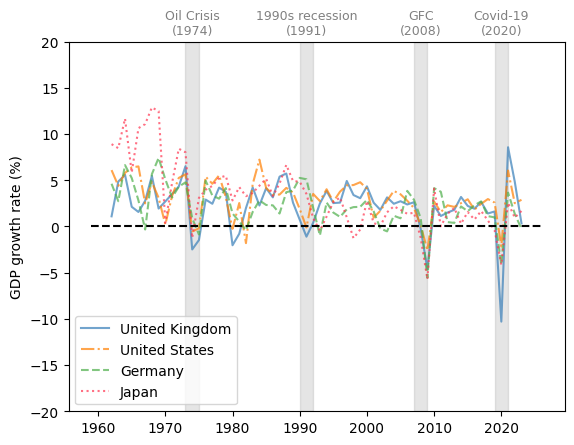
Figure 7:Developed economies (GDP growth rate %)
We choose Brazil, China, Argentina, and Mexico as representative developing economies.
Source
fig, ax = plt.subplots()
countries = ['Brazil', 'China', 'Argentina', 'Mexico']
plot_comparison(gdp_growth.loc[countries, 1962:],
                countries, ylabel,
                0.1, 20, ax,
                g_params, b_params, t_params)
plt.show()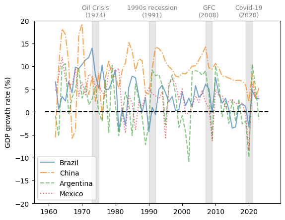
Figure 8:Developing economies (GDP growth rate %)
The comparison of GDP growth rates above suggests that business cycles are becoming more synchronized in 21st-century recessions.
However, emerging and less developed economies often experience more volatile changes throughout the economic cycles.
Despite the synchronization in GDP growth, the experience of individual countries during the recession often differs.
We use the unemployment rate and the recovery of labor market conditions as another example.
Here we compare the unemployment rate of the United States, the United Kingdom, Japan, and France.
Source
unempl_rate = wb.data.DataFrame('SL.UEM.TOTL.NE.ZS',
    ['USA', 'FRA', 'GBR', 'JPN'], labels=True)
unempl_rate = unempl_rate.set_index('Country')
unempl_rate.columns = unempl_rate.columns.str.replace('YR', '').astype(int)

fig, ax = plt.subplots()

countries = ['United Kingdom', 'United States', 'Japan', 'France']
ylabel = 'unemployment rate (national estimate) (%)'
plot_comparison(unempl_rate, countries,
                ylabel, 0.05, None, ax, g_params,
                b_params, t_params, baseline=None)
plt.show()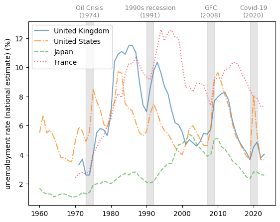
Figure 9:Developed economies (unemployment rate %)
We see that France, with its strong labor unions, typically experiences relatively slow labor market recoveries after negative shocks.
We also notice that Japan has a history of very low and stable unemployment rates.
3.6Leading indicators and correlated factors
Examining leading indicators and correlated factors helps policymakers to understand the causes and results of business cycles.
We will discuss potential leading indicators and correlated factors from three perspectives: consumption, production, and credit level.
3.6.1Consumption
Consumption depends on consumers’ confidence towards their income and the overall performance of the economy in the future.
One widely cited indicator for consumer confidence is the consumer sentiment index published by the University of Michigan.
Here we plot the University of Michigan Consumer Sentiment Index and year-on-year core consumer price index (CPI) change from 1978-2022 in the US.
Source
start_date = datetime.datetime(1978, 1, 1)
end_date = datetime.datetime(2022, 12, 31)

# Limit the plot to a specific range
start_date_graph = datetime.datetime(1977, 1, 1)
end_date_graph = datetime.datetime(2023, 12, 31)

nber = web.DataReader('USREC', 'fred', start_date, end_date)
consumer_confidence = web.DataReader('UMCSENT', 'fred',
                                start_date, end_date)

fig, ax = plt.subplots()
ax.plot(consumer_confidence, **g_params,
        color='#377eb8', linestyle='-',
        linewidth=2)
ax.fill_between(nber.index, 0, 1,
            where=nber['USREC']==1,
            color='grey', edgecolor='none',
            alpha=0.3,
            transform=ax.get_xaxis_transform(),
            label='NBER recession indicators')
ax.set_ylim([0, ax.get_ylim()[1]])
ax.set_ylabel('consumer sentiment index')

# Plot CPI on another y-axis
ax_t = ax.twinx()
inflation = web.DataReader('CPILFESL', 'fred',
                start_date, end_date).pct_change(12)*100

# Add CPI on the legend without drawing the line again
ax_t.plot(2020, 0, **g_params, linestyle='-',
          linewidth=2, label='consumer sentiment index')
ax_t.plot(inflation, **g_params,
          color='#ff7f00', linestyle='--',
          linewidth=2, label='CPI YoY change (%)')

ax_t.fill_between(nber.index, 0, 1,
                  where=nber['USREC']==1,
                  color='grey', edgecolor='none',
                  alpha=0.3,
                  transform=ax.get_xaxis_transform(),
                  label='NBER recession indicators')
ax_t.set_ylim([0, ax_t.get_ylim()[1]])
ax_t.set_xlim([start_date_graph, end_date_graph])
ax_t.legend(loc='upper center',
            bbox_to_anchor=(0.5, 1.1),
            ncol=3, fontsize=9)
ax_t.set_ylabel('CPI YoY change (%)')
plt.show()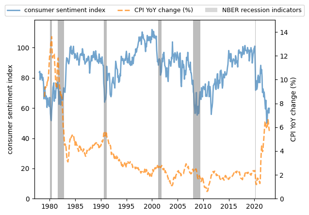
Figure 10:Consumer sentiment index and YoY CPI change, US
We see that
- consumer sentiment often remains high during expansions and drops before recessions.
- there is a clear negative correlation between consumer sentiment and the CPI.
When the price of consumer commodities rises, consumer confidence diminishes.
This trend is more significant during stagflation.
3.6.2Production
Real industrial output is highly correlated with recessions in the economy.
However, it is not a leading indicator, as the peak of contraction in production is delayed relative to consumer confidence and inflation.
We plot the real industrial output change from the previous year from 1919 to 2022 in the US to show this trend.
Source
start_date = datetime.datetime(1919, 1, 1)
end_date = datetime.datetime(2022, 12, 31)

nber = web.DataReader('USREC', 'fred',
                    start_date, end_date)
industrial_output = web.DataReader('INDPRO', 'fred',
                    start_date, end_date).pct_change(12)*100

fig, ax = plt.subplots()
ax.plot(industrial_output, **g_params,
        color='#377eb8', linestyle='-',
        linewidth=2, label='Industrial production index')
ax.fill_between(nber.index, 0, 1,
                where=nber['USREC']==1,
                color='grey', edgecolor='none',
                alpha=0.3,
                transform=ax.get_xaxis_transform(),
                label='NBER recession indicators')
ax.set_ylim([ax.get_ylim()[0], ax.get_ylim()[1]])
ax.set_ylabel('YoY real output change (%)')
plt.show()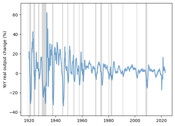
Figure 11:YoY real output change, US (%)
We observe the delayed contraction in the plot across recessions.
3.6.3Credit level
Credit contractions often occur during recessions, as lenders become more cautious and borrowers become more hesitant to take on additional debt.
This is due to factors such as a decrease in overall economic activity and gloomy expectations for the future.
One example is domestic credit to the private sector by banks in the UK.
The following graph shows the domestic credit to the private sector as a percentage of GDP by banks from 1970 to 2022 in the UK.
Source
private_credit = wb.data.DataFrame('FS.AST.PRVT.GD.ZS',
                ['GBR'], labels=True)
private_credit = private_credit.set_index('Country')
private_credit.columns = private_credit.columns.str.replace('YR', '').astype(int)

fig, ax = plt.subplots()

countries = 'United Kingdom'
ylabel = 'credit level (% of GDP)'
ax = plot_series(private_credit, countries,
                 ylabel, 0.05, ax, g_params, b_params,
                 t_params, ylim=None, baseline=None)
plt.show()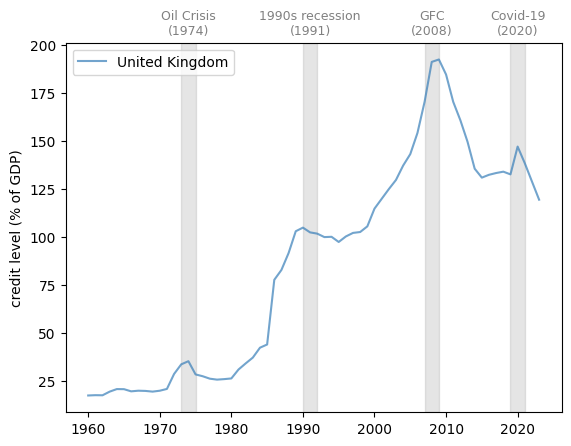
Figure 12:Domestic credit to private sector by banks (% of GDP)
Note that the credit rises during economic expansions and stagnates or even contracts after recessions.

Creative Commons License – This work is licensed under a Creative Commons Attribution-ShareAlike 4.0 International.