7. Introduction to Supply and Demand
7.1Overview
This lecture is about some models of equilibrium prices and quantities, one of the core topics of elementary microeconomics.
Throughout the lecture, we focus on models with one good and one price.
7.1.1Why does this model matter?
In the 15th, 16th, 17th and 18th centuries, mercantilist ideas held sway among most rulers of European countries.
Exports were regarded as good because they brought in bullion (gold flowed into the country).
Imports were regarded as bad because bullion was required to pay for them (gold flowed out).
This zero-sum view of economics was eventually overturned by the work of the classical economists such as Adam Smith and David Ricardo, who showed how freeing domestic and international trade can enhance welfare.
There are many different expressions of this idea in economics.
This lecture discusses one of the simplest: how free adjustment of prices can maximize a measure of social welfare in the market for a single good.
7.1.2Topics and infrastructure
Key infrastructure concepts that we will encounter in this lecture are:
- inverse demand curves
- inverse supply curves
- consumer surplus
- producer surplus
- integration
- social welfare as the sum of consumer and producer surpluses
- the relationship between equilibrium quantity and social welfare optimum
In our exposition we will use the following Python imports.
import numpy as np
import matplotlib.pyplot as plt
from collections import namedtuple7.2Consumer surplus
Before we look at the model of supply and demand, it will be helpful to have some background on (a) consumer and producer surpluses and (b) integration.
(If you are comfortable with both topics you can jump to the next section.)
7.2.1A discrete example
If is the price of the good and is the amount that consumer is willing to pay, then buys when .
The consumer surplus of the -th consumer is
- if , then the consumer buys and gets surplus
- if , then the consumer does not buy and gets surplus 0
For example, if the price is , then consumer 1 gets surplus .
The bar graph below shows the surplus of each consumer when .
The total height of each bar is willingness to pay by consumer .
The orange portion of some of the bars shows consumer surplus.
fig, ax = plt.subplots()
consumers = range(1, 11) # consumers 1,..., 10
# willingness to pay for each consumer
wtp = (98, 72, 41, 38, 29, 21, 17, 12, 11, 10)
price = 25
ax.bar(consumers, wtp, label="consumer surplus", color="darkorange", alpha=0.8)
ax.plot((0, 12), (price, price), lw=2, label="price $p$")
ax.bar(consumers, [min(w, price) for w in wtp], color="black", alpha=0.6)
ax.set_xlim(0, 12)
ax.set_xticks(consumers)
ax.set_ylabel("willingness to pay, price")
ax.set_xlabel("consumer, quantity")
ax.legend()
plt.show()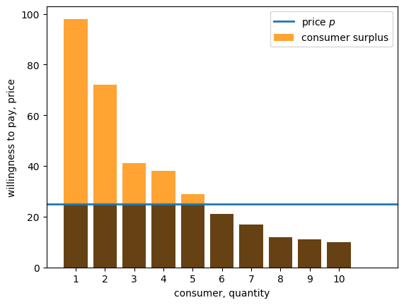
Figure 1:Willingness to pay (discrete)
The total consumer surplus in this market is
Since consumer surplus of consumer is a measure of her gains from trade (i.e., extent to which the good is valued over and above the amount the consumer had to pay), it is reasonable to consider total consumer surplus as a measurement of consumer welfare.
Later we will pursue this idea further, considering how different prices lead to different welfare outcomes for consumers and producers.
7.2.2A comment on quantity.
Notice that in the figure, the horizontal axis is labeled “consumer, quantity”.
We have added “quantity” here because we can read the number of units sold from this axis, assuming for now that there are sellers who are willing to sell as many units as the consumers demand, given the current market price .
In this example, consumers 1 to 5 buy, and the quantity sold is 5.
Below we drop the assumption that sellers will provide any amount at a given price and study how this changes outcomes.
7.2.3A continuous approximation
It is often convenient to assume that there is a “very large number” of consumers, so that willingness to pay becomes a continuous curve.
As before, the vertical axis measures willingness to pay, while the horizontal axis measures quantity.
This kind of curve is called an inverse demand curve
An example is provided below, showing both an inverse demand curve and a set price.
The inverse demand curve is given by
def inverse_demand(q):
    return 100 * np.exp(- q)

# build a grid to evaluate the function at different values of q
q_min, q_max = 0, 5
q_grid = np.linspace(q_min, q_max, 1000)

# plot the inverse demand curve
fig, ax = plt.subplots()
ax.plot((q_min, q_max), (price, price), lw=2, label="price")
ax.plot(q_grid, inverse_demand(q_grid),
        color="orange", label="inverse demand curve")
ax.set_ylabel("willingness to pay, price")
ax.set_xlabel("quantity")
ax.set_xlim(q_min, q_max)
ax.set_ylim(0, 110)
ax.legend()
plt.show()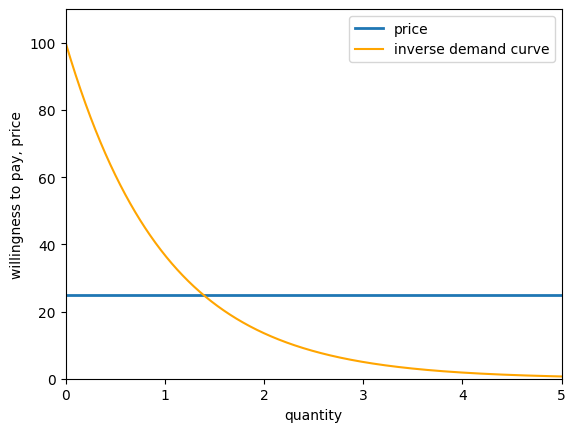
Figure 2:Willingness to pay (continuous)
Reasoning by analogy with the discrete case, the area under the demand curve and above the price is called the consumer surplus, and is a measure of total gains from trade on the part of consumers.
The consumer surplus is shaded in the figure below.
# solve for the value of q where demand meets price
q_star = np.log(100) - np.log(price)

fig, ax = plt.subplots()
ax.plot((q_min, q_max), (price, price), lw=2, label="price")
ax.plot(q_grid, inverse_demand(q_grid),
        color="orange", label="inverse demand curve")
small_grid = np.linspace(0, q_star, 500)
ax.fill_between(small_grid, np.full(len(small_grid), price),
                inverse_demand(small_grid), color="orange",
                alpha=0.5, label="consumer surplus")
ax.vlines(q_star, 0, price, ls="--")
ax.set_ylabel("willingness to pay, price")
ax.set_xlabel("quantity")
ax.set_xlim(q_min, q_max)
ax.set_ylim(0, 110)
ax.text(q_star, -10, "$q^*$")
ax.legend()
plt.show()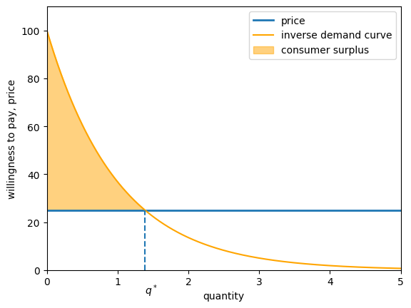
Figure 3:Willingness to pay (continuous) with consumer surplus
The value is where the inverse demand curve meets price.
7.3Producer surplus
Having discussed demand, let’s now switch over to the supply side of the market.
7.3.1The discrete case
The figure below shows the price at which a collection of producers, also numbered 1 to 10, are willing to sell one unit of the good in question
fig, ax = plt.subplots()
producers = range(1, 11) # producers 1,..., 10
# willingness to sell for each producer
wts = (5, 8, 17, 22, 35, 39, 46, 57, 88, 91)
price = 25
ax.bar(producers, wts, label="willingness to sell", color="green", alpha=0.5)
ax.set_xlim(0, 12)
ax.set_xticks(producers)
ax.set_ylabel("willingness to sell")
ax.set_xlabel("producer")
ax.legend()
plt.show()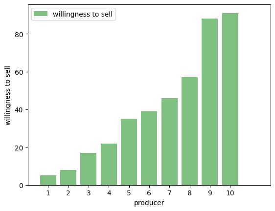
Figure 4:Willingness to sell (discrete)
Let be the price at which producer is willing to sell the good.
When the price is , producer surplus for producer is .
def inverse_supply(q):
    return 2 * q**2

# solve for the value of q where supply meets price
q_star = (price / 2)**(1/2)

# plot the inverse supply curve
fig, ax = plt.subplots()
ax.plot((q_min, q_max), (price, price), lw=2, label="price")
ax.plot(q_grid, inverse_supply(q_grid),
        color="green", label="inverse supply curve")
small_grid = np.linspace(0, q_star, 500)
ax.fill_between(small_grid, inverse_supply(small_grid),
                np.full(len(small_grid), price),
                color="green",
                alpha=0.5, label="producer surplus")
ax.vlines(q_star, 0, price, ls="--")
ax.set_ylabel("willingness to sell, price")
ax.set_xlabel("quantity")
ax.set_xlim(q_min, q_max)
ax.set_ylim(0, 60)
ax.text(q_star, -10, "$q^*$")
ax.legend()
plt.show()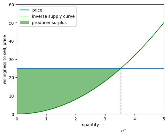
Figure 5:Willingness to sell (continuous) with producer surplus
7.4Integration
How can we calculate the consumer and producer surplus in the continuous case?
The short answer is: by using integration.
Some readers will already be familiar with the basics of integration.
For those who are not, here is a quick introduction.
In general, for a function , the integral of over the interval is the area under the curve between and .
This value is written as and illustrated in the figure below when .
def f(x):
    return np.cos(x/2) + 1

xmin, xmax = 0, 5
a, b = 1, 3
x_grid = np.linspace(xmin, xmax, 1000)
ab_grid = np.linspace(a, b, 400)

fig, ax = plt.subplots()
ax.plot(x_grid, f(x_grid), label="$f$", color="k")
ax.fill_between(ab_grid, [0] * len(ab_grid), f(ab_grid),
                label=r"$\int_a^b f(x) dx$")
ax.legend()
plt.show()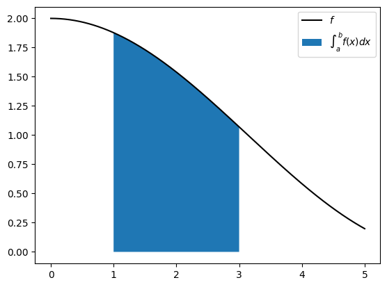
Figure 6:Area under the curve
There are many rules for calculating integrals, with different rules applying to different choices of .
Many of these rules relate to one of the most beautiful and powerful results in all of mathematics: the fundamental theorem of calculus.
We will not try to cover these ideas here, partly because the subject is too big, and partly because you only need to know one rule for this lecture, stated below.
If , then
In fact this rule is so simple that it can be calculated from elementary geometry -- you might like to try by graphing and calculating the area under the curve between and .
We use this rule repeatedly in what follows.
7.5Supply and demand
Let’s now put supply and demand together.
This leads us to the all important notion of market equilibrium, and from there onto a discussion of equilibria and welfare.
For most of this discussion, we’ll assume that inverse demand and supply curves are affine functions of quantity.
We’ll also assume affine inverse supply and demand functions when we study models with multiple consumption goods in our subsequent lecture.
We do this in order to simplify the exposition and enable us to use just a few tools from linear algebra, namely, matrix multiplication and matrix inversion.
We study a market for a single good in which buyers and sellers exchange a quantity for a price .
Quantity and price are both scalars.
We assume that inverse demand and supply curves for the good are:
We call them inverse demand and supply curves because price is on the left side of the equation rather than on the right side as it would be in a direct demand or supply function.
We can use a namedtuple to store the parameters for our single good market.
Market = namedtuple('Market', ['d_0', # demand intercept
                               'd_1', # demand slope
                               's_0', # supply intercept
                               's_1'] # supply slope
                   )
The function below creates an instance of a Market namedtuple with default values.
def create_market(d_0=1.0, d_1=0.6, s_0=0.1, s_1=0.4):
    return Market(d_0=d_0, d_1=d_1, s_0=s_0, s_1=s_1)
This market can then be used by our inverse_demand and inverse_supply functions.
def inverse_demand(q, model):
    return model.d_0 - model.d_1 * q

def inverse_supply(q, model):
    return model.s_0 + model.s_1 * q
Here is a plot of these two functions using market.
market = create_market()

grid_min, grid_max, grid_size = 0, 1.5, 200
q_grid = np.linspace(grid_min, grid_max, grid_size)
supply_curve = inverse_supply(q_grid, market)
demand_curve = inverse_demand(q_grid, market)

fig, ax = plt.subplots()
ax.plot(q_grid, supply_curve, label='supply', color='green')
ax.plot(q_grid, demand_curve, label='demand', color='orange')
ax.legend(loc='upper center', frameon=False)
ax.set_ylim(0, 1.2)
ax.set_xticks((0, 1))
ax.set_yticks((0, 1))
ax.set_xlabel('quantity')
ax.set_ylabel('price')
plt.show()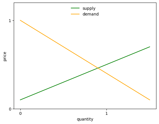
Figure 7:Supply and demand
In the above graph, an equilibrium price-quantity pair occurs at the intersection of the supply and demand curves.
7.5.1Consumer surplus
Let a quantity be given and let be the corresponding price on the inverse demand curve.
We define consumer surplus as the area under an inverse demand curve minus :
The next figure illustrates
Source
q = 1.25
p = inverse_demand(q, market)
ps = np.ones_like(q_grid) * p

fig, ax = plt.subplots()
ax.plot(q_grid, demand_curve, label='demand', color='orange')
ax.fill_between(q_grid[q_grid <= q],
                demand_curve[q_grid <= q],
                ps[q_grid <= q],
                label='consumer surplus',
                color="orange",
                alpha=0.5)
ax.vlines(q, 0, p, linestyle="dashed", color='black', alpha=0.7)
ax.hlines(p, 0, q, linestyle="dashed", color='black', alpha=0.7)

ax.legend(loc='upper center', frameon=False)
ax.set_ylim(0, 1.2)
ax.set_xticks((q,))
ax.set_xticklabels(("$q$",))
ax.set_yticks((p,))
ax.set_yticklabels(("$p$",))
ax.set_xlabel('quantity')
ax.set_ylabel('price')
plt.show()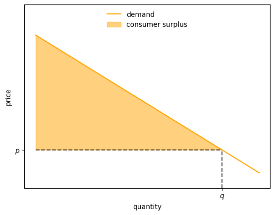
Figure 8:Supply and demand (consumer surplus)
Consumer surplus provides a measure of total consumer welfare at quantity .
The idea is that the inverse demand curve shows a consumer’s willingness to pay for an additional increment of the good at a given quantity .
The difference between willingness to pay and the actual price is consumer surplus.
The value is the “sum” (i.e., integral) of these surpluses when the total quantity purchased is and the purchase price is .
Evaluating the integral in the definition of consumer surplus (8) gives
7.5.2Producer surplus
Let a quantity be given and let be the corresponding price on the inverse supply curve.
We define producer surplus as minus the area under an inverse supply curve
The next figure illustrates
Source
q = 0.75
p = inverse_supply(q, market)
ps = np.ones_like(q_grid) * p

fig, ax = plt.subplots()
ax.plot(q_grid, supply_curve, label='supply', color='green')
ax.fill_between(q_grid[q_grid <= q],
                supply_curve[q_grid <= q],
                ps[q_grid <= q],
                label='producer surplus',
                color="green",
                alpha=0.5)
ax.vlines(q, 0, p, linestyle="dashed", color='black', alpha=0.7)
ax.hlines(p, 0, q, linestyle="dashed", color='black', alpha=0.7)

ax.legend(loc='upper center', frameon=False)
ax.set_ylim(0, 1.2)
ax.set_xticks((q,))
ax.set_xticklabels(("$q$",))
ax.set_yticks((p,))
ax.set_yticklabels(("$p$",))
ax.set_xlabel('quantity')
ax.set_ylabel('price')
plt.show()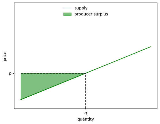
Figure 9:Supply and demand (producer surplus)
Producer surplus measures total producer welfare at quantity
The idea is similar to that of consumer surplus.
The inverse supply curve shows the price at which producers are prepared to sell, given quantity .
The difference between willingness to sell and the actual price is producer surplus.
The value is the integral of these surpluses.
Evaluating the integral in the definition of producer surplus (10) gives
7.5.3Social welfare
Sometimes economists measure social welfare by a welfare criterion that equals consumer surplus plus producer surplus, assuming that consumers and producers pay the same price:
Evaluating the integrals gives
Here is a Python function that evaluates this social welfare at a given quantity and a fixed set of parameters.
def W(q, market):
    # Compute and return welfare
    return (market.d_0 - market.s_0) * q - 0.5 * (market.d_1 + market.s_1) * q**2
The next figure plots welfare as a function of .
Source
q_vals = np.linspace(0, 1.78, 200)
fig, ax = plt.subplots()
ax.plot(q_vals, W(q_vals, market), label='welfare', color='brown')
ax.legend(frameon=False)
ax.set_xlabel('quantity')
plt.show()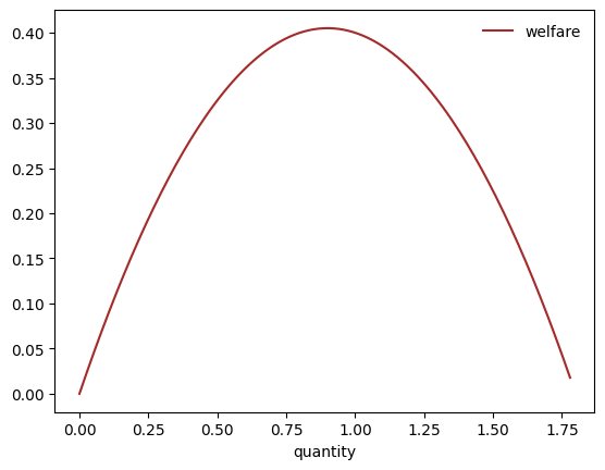
Figure 10:Welfare
Let’s now give a social planner the task of maximizing social welfare.
To compute a quantity that maximizes the welfare criterion, we differentiate with respect to and then set the derivative to zero.
Solving for yields
Let’s remember the quantity given by equation (15) that a social planner would choose to maximize consumer surplus plus producer surplus.
We’ll compare it to the quantity that emerges in a competitive equilibrium that equates supply to demand.
7.5.4Competitive equilibrium
Instead of equating quantities supplied and demanded, we can accomplish the same thing by equating demand price to supply price:
If we solve the equation defined by the second equality in the above line for , we obtain
This is the competitive equilibrium quantity.
Observe that the equilibrium quantity equals the same given by equation (15).
The outcome that the quantity determined by equation (15) equates supply to demand brings us a key finding:
- a competitive equilibrium quantity maximizes our welfare criterion
This is a version of the first fundamental welfare theorem,
It also brings a useful competitive equilibrium computation strategy:
- after solving the welfare problem for an optimal quantity, we can read a competitive equilibrium price from either supply price or demand price at the competitive equilibrium quantity
7.6Generalizations
In a later lecture, we’ll derive generalizations of the above demand and supply curves from other objects.
Our generalizations will extend the preceding analysis of a market for a single good to the analysis of simultaneous markets in goods.
In addition
we’ll derive demand curves from a consumer problem that maximizes a utility function subject to a budget constraint.
we’ll derive supply curves from the problem of a producer who is price taker and maximizes his profits minus total costs that are described by a cost function.
7.7Exercises
Suppose now that the inverse demand and supply curves are modified to take the form
All parameters are positive, as before.
Solution to Exercise 1
Let’s update the inverse_demand and inverse_supply functions, as defined above.
def inverse_demand(q, model):
    return model.d_0 - model.d_1 * q**0.6

def inverse_supply(q, model):
    return model.s_0 + model.s_1 * q**1.8
Here is a plot of inverse supply and demand.
grid_min, grid_max, grid_size = 0, 1.5, 200
q_grid = np.linspace(grid_min, grid_max, grid_size)
market = create_market()
supply_curve = inverse_supply(q_grid, market)
demand_curve = inverse_demand(q_grid, market)

fig, ax = plt.subplots()
ax.plot(q_grid, supply_curve, label='supply', color='green')
ax.plot(q_grid, demand_curve, label='demand', color='orange')
ax.legend(loc='upper center', frameon=False)
ax.set_ylim(0, 1.2)
ax.set_xticks((0, 1))
ax.set_yticks((0, 1))
ax.set_xlabel('quantity')
ax.set_ylabel('price')
plt.show()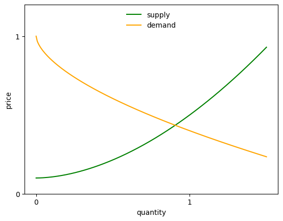
Solution to Exercise 2
Solving the integrals gives
Here’s a Python function that computes this value:
def W(q, market):
    # Compute and return welfare
    S_c = market.d_0 * q - market.d_1 * q**1.6 / 1.6
    S_p = market.s_0 * q + market.s_1 * q**2.8 / 2.8
    return S_c - S_p
The next figure plots welfare as a function of .
fig, ax = plt.subplots()
ax.plot(q_vals, W(q_vals, market), label='welfare', color='brown')
ax.legend(frameon=False)
ax.set_xlabel('quantity')
plt.show()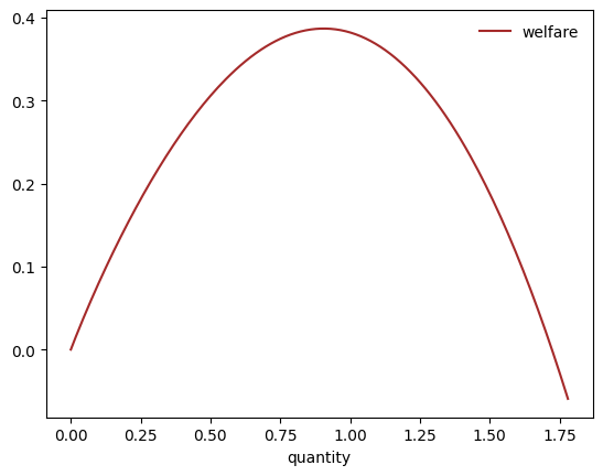
Solution to Exercise 3
from scipy.optimize import minimize_scalar

def objective(q):
    return -W(q, market)

result = minimize_scalar(objective, bounds=(0, 10))
print(result.message)
Solution found.
maximizing_q = result.x
print(f"{maximizing_q: .5f}")
0.90564
Solution to Exercise 4
from scipy.optimize import newton

def excess_demand(q):
    return inverse_demand(q, market) - inverse_supply(q, market)

equilibrium_q = newton(excess_demand, 0.99)
print(f"{equilibrium_q: .5f}")
0.90564

Creative Commons License – This work is licensed under a Creative Commons Attribution-ShareAlike 4.0 International.