6. Income and Wealth Inequality
6.1Overview
In the lecture Long-Run Growth we studied how GDP per capita has changed for certain countries and regions.
Per capita GDP is important because it gives us an idea of average income for households in a given country.
However, when we study income and wealth, averages are only part of the story.
The example above suggests that we should go beyond simple averages when we study income and wealth.
This leads us to the topic of economic inequality, which examines how income and wealth (and other quantities) are distributed across a population.
In this lecture we study inequality, beginning with measures of inequality and then applying them to wealth and income data from the US and other countries.
6.1.1Some history
Many historians argue that inequality played a role in the fall of the Roman Republic (see, e.g., Levitt (2019)).
Following the defeat of Carthage and the invasion of Spain, money flowed into Rome from across the empire, greatly enriched those in power.
Meanwhile, ordinary citizens were taken from their farms to fight for long periods, diminishing their wealth.
The resulting growth in inequality was a driving factor behind political turmoil that shook the foundations of the republic.
Eventually, the Roman Republic gave way to a series of dictatorships, starting with Octavian (Augustus) in 27 BCE.
This history tells us that inequality matters, in the sense that it can drive major world events.
There are other reasons that inequality might matter, such as how it affects human welfare.
With this motivation, let us start to think about what inequality is and how we can quantify and analyze it.
6.1.2Measurement
In politics and popular media, the word “inequality” is often used quite loosely, without any firm definition.
To bring a scientific perspective to the topic of inequality we must start with careful definitions.
Hence we begin by discussing ways that inequality can be measured in economic research.
We will need to install the following packages
!pip install wbgapi plotlyOutput
Collecting wbgapi
  Using cached wbgapi-1.0.12-py3-none-any.whl.metadata (13 kB)
Requirement already satisfied: plotly in /opt/hostedtoolcache/Python/3.12.9/x64/lib/python3.12/site-packages (6.0.0)
Requirement already satisfied: requests in /opt/hostedtoolcache/Python/3.12.9/x64/lib/python3.12/site-packages (from wbgapi) (2.32.3)
Requirement already satisfied: PyYAML in /opt/hostedtoolcache/Python/3.12.9/x64/lib/python3.12/site-packages (from wbgapi) (6.0.2)
Collecting tabulate (from wbgapi)
Using cached tabulate-0.9.0-py3-none-any.whl.metadata (34 kB)
Requirement already satisfied: narwhals>=1.15.1 in /opt/hostedtoolcache/Python/3.12.9/x64/lib/python3.12/site-packages (from plotly) (1.27.1)
Requirement already satisfied: packaging in /opt/hostedtoolcache/Python/3.12.9/x64/lib/python3.12/site-packages (from plotly) (24.2)
Requirement already satisfied: charset-normalizer<4,>=2 in /opt/hostedtoolcache/Python/3.12.9/x64/lib/python3.12/site-packages (from requests->wbgapi) (3.4.1)
Requirement already satisfied: idna<4,>=2.5 in /opt/hostedtoolcache/Python/3.12.9/x64/lib/python3.12/site-packages (from requests->wbgapi) (3.10)
Requirement already satisfied: urllib3<3,>=1.21.1 in /opt/hostedtoolcache/Python/3.12.9/x64/lib/python3.12/site-packages (from requests->wbgapi) (2.3.0)
Requirement already satisfied: certifi>=2017.4.17 in /opt/hostedtoolcache/Python/3.12.9/x64/lib/python3.12/site-packages (from requests->wbgapi) (2025.1.31)
Using cached wbgapi-1.0.12-py3-none-any.whl (36 kB)
Using cached tabulate-0.9.0-py3-none-any.whl (35 kB)
Installing collected packages: tabulate, wbgapi
Successfully installed tabulate-0.9.0 wbgapi-1.0.12
We will also use the following imports.
import pandas as pd
import numpy as np
import matplotlib.pyplot as plt
import random as rd
import wbgapi as wb
import plotly.express as px6.2The Lorenz curve
One popular measure of inequality is the Lorenz curve.
In this section we define the Lorenz curve and examine its properties.
6.2.1Definition
The Lorenz curve takes a sample and produces a curve .
We suppose that the sample has been sorted from smallest to largest.
To aid our interpretation, suppose that we are measuring wealth
- is the wealth of the poorest member of the population, and
- is the wealth of the richest member of the population.
The curve is just a function that we can plot and interpret.
To create it we first generate data points according to
Now the Lorenz curve is formed from these data points using interpolation.
If we use a line plot in matplotlib, the interpolation will be done for us.
The meaning of the statement is that the lowest % of people have % of all wealth.
- if and , then the bottom 50% of the population owns 10% of the wealth.
In the discussion above we focused on wealth but the same ideas apply to income, consumption, etc.
6.2.2Lorenz curves of simulated data
Let’s look at some examples and try to build understanding.
First let us construct a lorenz_curve function that we can
use in our simulations below.
It is useful to construct a function that translates an array of income or wealth data into the cumulative share of individuals (or households) and the cumulative share of income (or wealth).
def lorenz_curve(y):
    """
    Calculates the Lorenz Curve, a graphical representation of
    the distribution of income or wealth.

    It returns the cumulative share of people (x-axis) and
    the cumulative share of income earned.

    Parameters
    ----------
    y : array_like(float or int, ndim=1)
        Array of income/wealth for each individual.
        Unordered or ordered is fine.

    Returns
    -------
    cum_people : array_like(float, ndim=1)
        Cumulative share of people for each person index (i/n)
    cum_income : array_like(float, ndim=1)
        Cumulative share of income for each person index


    References
    ----------
    .. [1] https://en.wikipedia.org/wiki/Lorenz_curve

    Examples
    --------
    >>> a_val, n = 3, 10_000
    >>> y = np.random.pareto(a_val, size=n)
    >>> f_vals, l_vals = lorenz(y)

    """

    n = len(y)
    y = np.sort(y)
    s = np.zeros(n + 1)
    s[1:] = np.cumsum(y)
    cum_people = np.zeros(n + 1)
    cum_income = np.zeros(n + 1)
    for i in range(1, n + 1):
        cum_people[i] = i / n
        cum_income[i] = s[i] / s[n]
    return cum_people, cum_income
In the next figure, we generate draws from a lognormal distribution and treat these draws as our population.
The straight 45-degree line ( for all ) corresponds to perfect equality.
The log-normal draws produce a less equal distribution.
For example, if we imagine these draws as being observations of wealth across a sample of households, then the dashed lines show that the bottom 80% of households own just over 40% of total wealth.
n = 2000
sample = np.exp(np.random.randn(n))

fig, ax = plt.subplots()

f_vals, l_vals = lorenz_curve(sample)
ax.plot(f_vals, l_vals, label=f'lognormal sample', lw=2)
ax.plot(f_vals, f_vals, label='equality', lw=2)

ax.vlines([0.8], [0.0], [0.43], alpha=0.5, colors='k', ls='--')
ax.hlines([0.43], [0], [0.8], alpha=0.5, colors='k', ls='--')
ax.set_xlim((0, 1))
ax.set_xlabel("share of households")
ax.set_ylim((0, 1))
ax.set_ylabel("share of wealth")
ax.legend()
plt.show()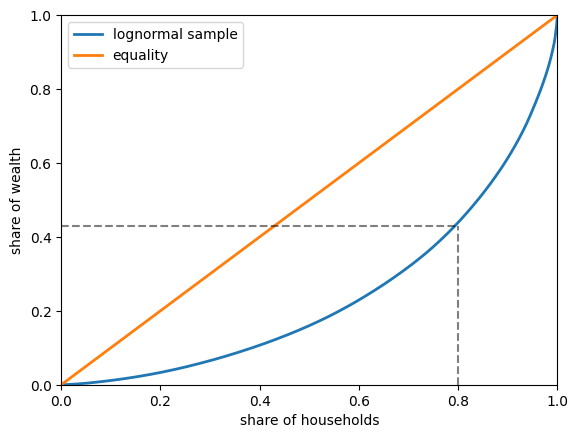
Figure 1:Lorenz curve of simulated wealth data
6.2.3Lorenz curves for US data
Next let’s look at US data for both income and wealth.
The following code block imports a subset of the dataset SCF_plus for 2016,
which is derived from the Survey of Consumer Finances (SCF).
url = 'https://github.com/QuantEcon/high_dim_data/raw/main/SCF_plus/SCF_plus_mini.csv'
df = pd.read_csv(url)
df_income_wealth = df.dropna()df_income_wealth.head(n=5)The next code block uses data stored in dataframe df_income_wealth to generate the Lorenz curves.
(The code is somewhat complex because we need to adjust the data according to population weights supplied by the SCF.)
Source
df = df_income_wealth

varlist = ['n_wealth',    # net wealth
           't_income',    # total income
           'l_income']    # labor income

years = df.year.unique()

# Create lists to store Lorenz data

F_vals, L_vals = [], []

for var in varlist:
    # create lists to store Lorenz curve data
    f_vals = []
    l_vals = []
    for year in years:

        # Repeat the observations according to their weights
        counts = list(round(df[df['year'] == year]['weights'] ))
        y = df[df['year'] == year][var].repeat(counts)
        y = np.asarray(y)

        # Shuffle the sequence to improve the plot
        rd.shuffle(y)

        # calculate and store Lorenz curve data
        f_val, l_val = lorenz_curve(y)
        f_vals.append(f_val)
        l_vals.append(l_val)

    F_vals.append(f_vals)
    L_vals.append(l_vals)

f_vals_nw, f_vals_ti, f_vals_li = F_vals
l_vals_nw, l_vals_ti, l_vals_li = L_vals
Now we plot Lorenz curves for net wealth, total income and labor income in the US in 2016.
Total income is the sum of households’ all income sources, including labor income but excluding capital gains.
(All income measures are pre-tax.)
fig, ax = plt.subplots()
ax.plot(f_vals_nw[-1], l_vals_nw[-1], label=f'net wealth')
ax.plot(f_vals_ti[-1], l_vals_ti[-1], label=f'total income')
ax.plot(f_vals_li[-1], l_vals_li[-1], label=f'labor income')
ax.plot(f_vals_nw[-1], f_vals_nw[-1], label=f'equality')
ax.set_xlabel("share of households")
ax.set_ylabel("share of income/wealth")
ax.legend()
plt.show()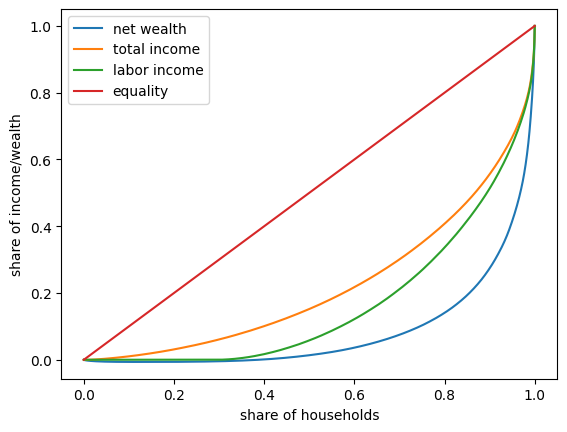
Figure 2:2016 US Lorenz curves
One key finding from this figure is that wealth inequality is more extreme than income inequality.
6.3The Gini coefficient
The Lorenz curve provides a visual representation of inequality in a distribution.
Another way to study income and wealth inequality is via the Gini coefficient.
In this section we discuss the Gini coefficient and its relationship to the Lorenz curve.
6.3.1Definition
As before, suppose that the sample has been sorted from smallest to largest.
The Gini coefficient is defined for the sample above as
The Gini coefficient is closely related to the Lorenz curve.
In fact, it can be shown that its value is twice the area between the line of equality and the Lorenz curve (e.g., the shaded area in Fig. 3).
The idea is that indicates complete equality, while indicates complete inequality.
fig, ax = plt.subplots()
f_vals, l_vals = lorenz_curve(sample)
ax.plot(f_vals, l_vals, label=f'lognormal sample', lw=2)
ax.plot(f_vals, f_vals, label='equality', lw=2)
ax.fill_between(f_vals, l_vals, f_vals, alpha=0.06)
ax.set_ylim((0, 1))
ax.set_xlim((0, 1))
ax.text(0.04, 0.5, r'$G = 2 \times$ shaded area')
ax.set_xlabel("share of households (%)")
ax.set_ylabel("share of wealth (%)")
ax.legend()
plt.show()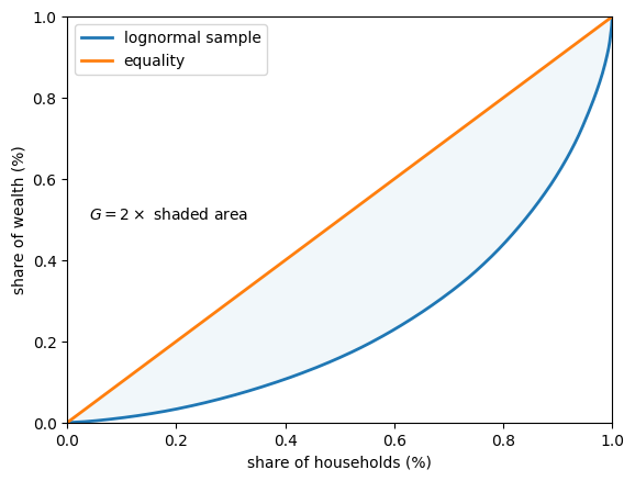
Figure 3:Gini coefficient (simulated wealth data)
In fact the Gini coefficient can also be expressed as
where is the area between the 45-degree line of perfect equality and the Lorenz curve, while is the area below the Lorenze curve -- see Fig. 4.
fig, ax = plt.subplots()
f_vals, l_vals = lorenz_curve(sample)
ax.plot(f_vals, l_vals, label='lognormal sample', lw=2)
ax.plot(f_vals, f_vals, label='equality', lw=2)
ax.fill_between(f_vals, l_vals, f_vals, alpha=0.06)
ax.fill_between(f_vals, l_vals, np.zeros_like(f_vals), alpha=0.06)
ax.set_ylim((0, 1))
ax.set_xlim((0, 1))
ax.text(0.55, 0.4, 'A')
ax.text(0.75, 0.15, 'B')
ax.set_xlabel("share of households")
ax.set_ylabel("share of wealth")
ax.legend()
plt.show()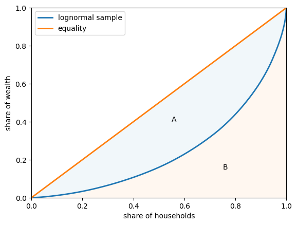
Figure 4:Lorenz curve and Gini coefficient
6.3.2Gini coefficient of simulated data
Let’s examine the Gini coefficient in some simulations.
The code below computes the Gini coefficient from a sample.
def gini_coefficient(y):
    r"""
    Implements the Gini inequality index

    Parameters
    ----------
    y : array_like(float)
        Array of income/wealth for each individual.
        Ordered or unordered is fine

    Returns
    -------
    Gini index: float
        The gini index describing the inequality of the array of income/wealth

    References
    ----------

    https://en.wikipedia.org/wiki/Gini_coefficient
    """
    n = len(y)
    i_sum = np.zeros(n)
    for i in range(n):
        for j in range(n):
            i_sum[i] += abs(y[i] - y[j])
    return np.sum(i_sum) / (2 * n * np.sum(y))
Now we can compute the Gini coefficients for five different populations.
Each of these populations is generated by drawing from a lognormal distribution with parameters μ (mean) and σ (standard deviation).
To create the five populations, we vary σ over a grid of length 5 between 0.2 and 4.
In each case we set .
This implies that the mean of the distribution does not change with σ.
You can check this by looking up the expression for the mean of a lognormal distribution.
%%time
k = 5
σ_vals = np.linspace(0.2, 4, k)
n = 2_000

ginis = []

for σ in σ_vals:
    μ = -σ**2 / 2
    y = np.exp(μ + σ * np.random.randn(n))
    ginis.append(gini_coefficient(y))
CPU times: user 14.5 s, sys: 8.41 ms, total: 14.5 s
Wall time: 18.9 s
Let’s build a function that returns a figure (so that we can use it later in the lecture).
def plot_inequality_measures(x, y, legend, xlabel, ylabel):
    fig, ax = plt.subplots()
    ax.plot(x, y, marker='o', label=legend)
    ax.set_xlabel(xlabel)
    ax.set_ylabel(ylabel)
    ax.legend()
    return fig, ax
fix, ax = plot_inequality_measures(σ_vals,
ginis,
'simulated',
r'$\sigma$',
'Gini coefficients')
plt.show()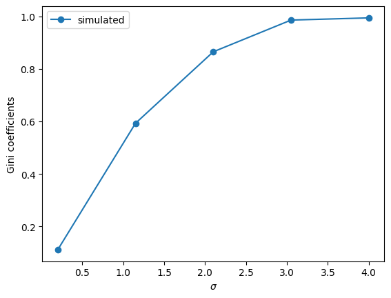
Figure 5:Gini coefficients of simulated data
The plots show that inequality rises with σ, according to the Gini coefficient.
6.3.3Gini coefficient for income (US data)
Let’s look at the Gini coefficient for the distribution of income in the US.
We will get pre-computed Gini coefficients (based on income) from the World Bank using the wbgapi.
Let’s use the wbgapi package we imported earlier to search the World Bank data for Gini to find the Series ID.
wb.search("gini")We now know the series ID is SI.POV.GINI.
(Another way to find the series ID is to use the World Bank data portal and then use wbgapi to fetch the data.)
To get a quick overview, let’s histogram Gini coefficients across all countries and all years in the World Bank dataset.
# Fetch gini data for all countries
gini_all = wb.data.DataFrame("SI.POV.GINI")
# remove 'YR' in index and convert to integer
gini_all.columns = gini_all.columns.map(lambda x: int(x.replace('YR','')))

# Create a long series with a multi-index of the data to get global min and max values
gini_all = gini_all.unstack(level='economy').dropna()

# Build a histogram
ax = gini_all.plot(kind="hist", bins=20)
ax.set_xlabel("Gini coefficient")
ax.set_ylabel("frequency")
plt.show()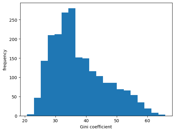
Figure 6:Histogram of Gini coefficients across countries
We can see in Fig. 6 that across 50 years of data and all countries the measure varies between 20 and 65.
Let us fetch the data DataFrame for the USA.
data = wb.data.DataFrame("SI.POV.GINI", "USA")
data.head(n=5)
# remove 'YR' in index and convert to integer
data.columns = data.columns.map(lambda x: int(x.replace('YR','')))
(This package often returns data with year information contained in the columns. This is not always convenient for simple plotting with pandas so it can be useful to transpose the results before plotting.)
data = data.T           # Obtain years as rows
data_usa = data['USA']  # pd.Series of US data
Let us take a look at the data for the US.
fig, ax = plt.subplots()
ax = data_usa.plot(ax=ax)
ax.set_ylim(data_usa.min()-1, data_usa.max()+1)
ax.set_ylabel("Gini coefficient (income)")
ax.set_xlabel("year")
plt.show()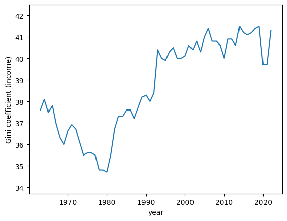
Figure 7:Gini coefficients for income distribution (USA)
As can be seen in Fig. 7, the income Gini trended upward from 1980 to 2020 and then dropped following at the start of the COVID pandemic.
6.3.4Gini coefficient for wealth
In the previous section we looked at the Gini coefficient for income, focusing on using US data.
Now let’s look at the Gini coefficient for the distribution of wealth.
We will use US data from the Survey of Consumer Finances
df_income_wealth.year.describe()count 509455.000000
mean 1982.122062
std 22.607350
min 1950.000000
25% 1959.000000
50% 1983.000000
75% 2004.000000
max 2016.000000
Name: year, dtype: float64This notebook can be used to compute this information over the full dataset.
data_url = 'https://github.com/QuantEcon/lecture-python-intro/raw/main/lectures/_static/lecture_specific/inequality/usa-gini-nwealth-tincome-lincome.csv'
ginis = pd.read_csv(data_url, index_col='year')
ginis.head(n=5)Let’s plot the Gini coefficients for net wealth.
fig, ax = plt.subplots()
ax.plot(years, ginis["n_wealth"], marker='o')
ax.set_xlabel("year")
ax.set_ylabel("Gini coefficient")
plt.show()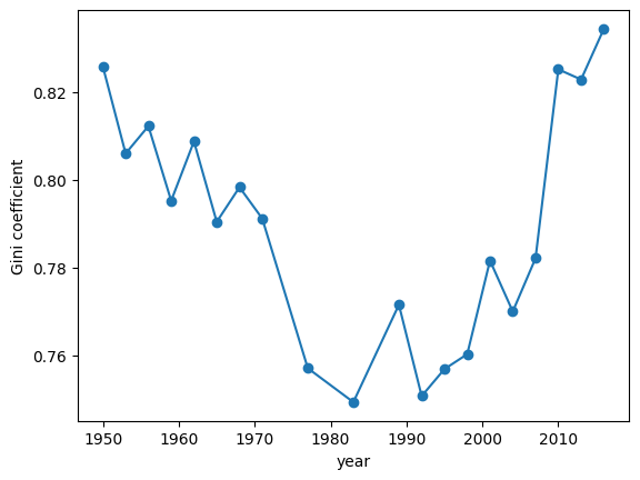
Figure 8:Gini coefficients of US net wealth
The time series for the wealth Gini exhibits a U-shape, falling until the early 1980s and then increasing rapidly.
One possibility is that this change is mainly driven by technology.
However, we will see below that not all advanced economies experienced similar growth of inequality.
6.3.5Cross-country comparisons of income inequality
Earlier in this lecture we used wbgapi to get Gini data across many countries
and saved it in a variable called gini_all
In this section we will use this data to compare several advanced economies, and to look at the evolution in their respective income Ginis.
data = gini_all.unstack()
data.columns
Index(['USA', 'GBR', 'FRA', 'CAN', 'SWE', 'IND', 'ITA', 'ISR', 'NOR', 'PAN',
...
'ARE', 'SYC', 'RUS', 'LCA', 'MMR', 'QAT', 'TUR', 'GRD', 'MHL', 'SUR'],
dtype='object', name='economy', length=169)There are 167 countries represented in this dataset.
Let us compare three advanced economies: the US, the UK, and Norway
ax = data[['USA','GBR', 'NOR']].plot()
ax.set_xlabel('year')
ax.set_ylabel('Gini coefficient')
ax.legend(title="")
plt.show()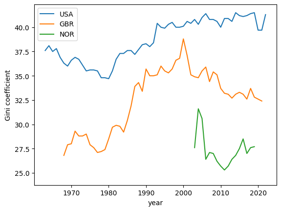
Figure 9:Gini coefficients for income (USA, United Kingdom, and Norway)
We see that Norway has a shorter time series.
Let us take a closer look at the underlying data and see if we can rectify this.
data[['NOR']].dropna().head(n=5)The data for Norway in this dataset goes back to 1979 but there are gaps in the time series and matplotlib is not showing those data points.
We can use the .ffill() method to copy and bring forward the last known value in a series to fill in these gaps
data['NOR'] = data['NOR'].ffill()
ax = data[['USA','GBR', 'NOR']].plot()
ax.set_xlabel('year')
ax.set_ylabel('Gini coefficient')
ax.legend(title="")
plt.show()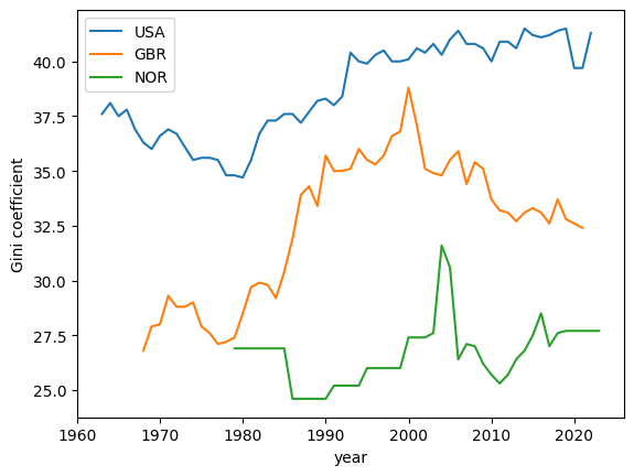
Figure 10:Gini coefficients for income (USA, United Kingdom, and Norway)
From this plot we can observe that the US has a higher Gini coefficient (i.e. higher income inequality) when compared to the UK and Norway.
Norway has the lowest Gini coefficient over the three economies and, moreover, the Gini coefficient shows no upward trend.
6.3.6Gini Coefficient and GDP per capita (over time)
We can also look at how the Gini coefficient compares with GDP per capita (over time).
Let’s take another look at the US, Norway, and the UK.
countries = ['USA', 'NOR', 'GBR']
gdppc = wb.data.DataFrame("NY.GDP.PCAP.KD", countries)
# remove 'YR' in index and convert to integer
gdppc.columns = gdppc.columns.map(lambda x: int(x.replace('YR','')))
gdppc = gdppc.T
We can rearrange the data so that we can plot GDP per capita and the Gini coefficient across years
plot_data = pd.DataFrame(data[countries].unstack())
plot_data.index.names = ['country', 'year']
plot_data.columns = ['gini']
Now we can get the GDP per capita data into a shape that can be merged with plot_data
pgdppc = pd.DataFrame(gdppc.unstack())
pgdppc.index.names = ['country', 'year']
pgdppc.columns = ['gdppc']
plot_data = plot_data.merge(pgdppc, left_index=True, right_index=True)
plot_data.reset_index(inplace=True)
Now we use Plotly to build a plot with GDP per capita on the y-axis and the Gini coefficient on the x-axis.
min_year = plot_data.year.min()
max_year = plot_data.year.max()
The time series for all three countries start and stop in different years.
We will add a year mask to the data to improve clarity in the chart including the different end years associated with each country’s time series.
labels = [1979, 1986, 1991, 1995, 2000, 2020, 2021, 2022] + \
         list(range(min_year,max_year,5))
plot_data.year = plot_data.year.map(lambda x: x if x in labels else None)
fig = px.line(plot_data,
x = "gini",
y = "gdppc",
color = "country",
text = "year",
height = 800,
labels = {"gini" : "Gini coefficient", "gdppc" : "GDP per capita"}
)
fig.update_traces(textposition="bottom right")
fig.show()only - Unknown Directive
only - Unknown DirectiveThis figure is built using `plotly` and is {ref}` available on the website <fig:plotly-gini-gdppc-years>`This plot shows that all three Western economies’ GDP per capita has grown over time with some fluctuations in the Gini coefficient.
From the early 80’s the United Kingdom and the US economies both saw increases in income inequality.
Interestingly, since the year 2000, the United Kingdom saw a decline in income inequality while the US exhibits persistent but stable levels around a Gini coefficient of 40.
6.4Top shares
Another popular measure of inequality is the top shares.
In this section we show how to compute top shares.
6.4.1Definition
As before, suppose that the sample has been sorted from smallest to largest.
Given the Lorenz curve defined above, the top share is defined as
Here is the floor function, which rounds any number down to the integer less than or equal to that number.
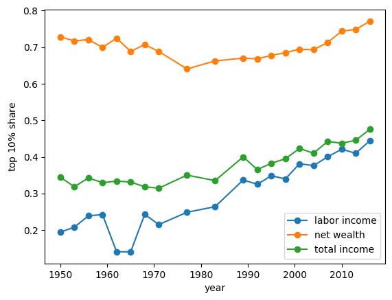
The following code uses the data from dataframe df_income_wealth to generate another dataframe df_topshares.
df_topshares stores the top 10 percent shares for the total income, the labor income and net wealth from 1950 to 2016 in US.
Source
# transfer the survey weights from absolute into relative values
df1 = df_income_wealth
df2 = df1.groupby('year').sum(numeric_only=True).reset_index()
df3 = df2[['year', 'weights']]
df3.columns = 'year', 'r_weights'
df4 = pd.merge(df3, df1, how="left", on=["year"])
df4['r_weights'] = df4['weights'] / df4['r_weights']

# create weighted nw, ti, li
df4['weighted_n_wealth'] = df4['n_wealth'] * df4['r_weights']
df4['weighted_t_income'] = df4['t_income'] * df4['r_weights']
df4['weighted_l_income'] = df4['l_income'] * df4['r_weights']

# extract two top 10% groups by net wealth and total income.
df6 = df4[df4['nw_groups'] == 'Top 10%']
df7 = df4[df4['ti_groups'] == 'Top 10%']

# calculate the sum of weighted top 10% by net wealth,
#   total income and labor income.
df5 = df4.groupby('year').sum(numeric_only=True).reset_index()
df8 = df6.groupby('year').sum(numeric_only=True).reset_index()
df9 = df7.groupby('year').sum(numeric_only=True).reset_index()

df5['weighted_n_wealth_top10'] = df8['weighted_n_wealth']
df5['weighted_t_income_top10'] = df9['weighted_t_income']
df5['weighted_l_income_top10'] = df9['weighted_l_income']

# calculate the top 10% shares of the three variables.
df5['topshare_n_wealth'] = df5['weighted_n_wealth_top10'] / \
    df5['weighted_n_wealth']
df5['topshare_t_income'] = df5['weighted_t_income_top10'] / \
    df5['weighted_t_income']
df5['topshare_l_income'] = df5['weighted_l_income_top10'] / \
    df5['weighted_l_income']

# we only need these vars for top 10 percent shares
df_topshares = df5[['year', 'topshare_n_wealth',
                    'topshare_t_income', 'topshare_l_income']]
Then let’s plot the top shares.
6.5Exercises
Solution to Exercise 1
Here is one solution:
def calculate_top_share(s, p=0.1):

    s = np.sort(s)
    n = len(s)
    index = int(n * (1 - p))
    return s[index:].sum() / s.sum()
k = 5
σ_vals = np.linspace(0.2, 4, k)
n = 2_000
topshares = []
ginis = []
f_vals = []
l_vals = []
for σ in σ_vals:
μ = -σ ** 2 / 2
y = np.exp(μ + σ * np.random.randn(n))
f_val, l_val = lorenz_curve(y)
f_vals.append(f_val)
l_vals.append(l_val)
ginis.append(gini_coefficient(y))
topshares.append(calculate_top_share(y))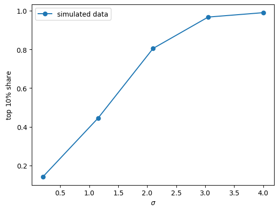
Figure 12:Top shares of simulated data
fig, ax = plot_inequality_measures(σ_vals,
                                  ginis,
                                  "simulated data",
                                  "$\sigma$",
                                  "gini coefficient")
plt.show()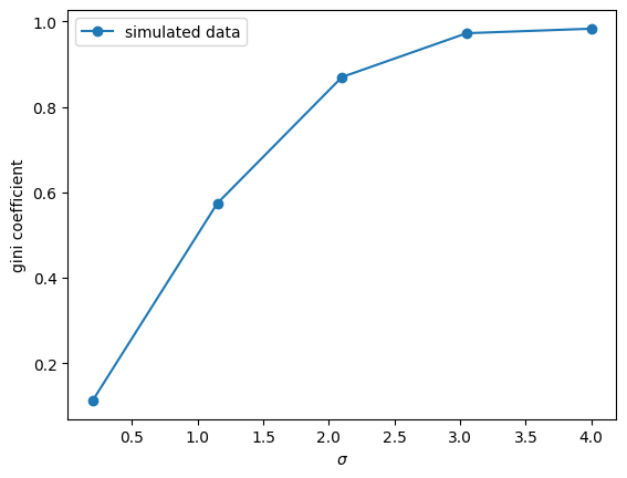
Figure 13:Gini coefficients of simulated data
fig, ax = plt.subplots()
ax.plot([0,1],[0,1], label=f"equality")
for i in range(len(f_vals)):
    ax.plot(f_vals[i], l_vals[i], label=f"$\sigma$ = {σ_vals[i]}")
plt.legend()
plt.show()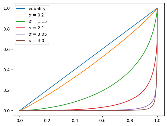
Figure 14:Lorenz curves for simulated data
Solution to Exercise 2
Here is one solution:
def lorenz2top(f_val, l_val, p=0.1):
    t = lambda x: np.interp(x, f_val, l_val)
    return 1- t(1 - p)
top_shares_nw = []
for f_val, l_val in zip(f_vals_nw, l_vals_nw):
top_shares_nw.append(lorenz2top(f_val, l_val))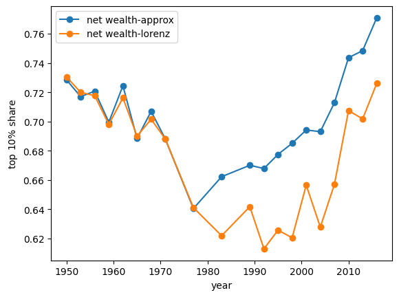
Figure 15:US top shares: approximation vs Lorenz
Solution to Exercise 3
Let’s take a look at some raw data for the US that is stored in df_income_wealth
df_income_wealth.describe()df_income_wealth.head(n=4)We will focus on wealth variable n_wealth to compute a Gini coefficient for the year 2016.
data = df_income_wealth[df_income_wealth.year == 2016].sample(3000, random_state=1)data.head(n=2)We can first compute the Gini coefficient using the function defined in the lecture above.
gini_coefficient(data.n_wealth.values)np.float64(0.9300769449032591)Now we can write a vectorized version using numpy
def gini(y):
    n = len(y)
    y_1 = np.reshape(y, (n, 1))
    y_2 = np.reshape(y, (1, n))
    g_sum = np.sum(np.abs(y_1 - y_2))
return g_sum / (2 * n * np.sum(y))gini(data.n_wealth.values)np.float64(0.9300769449032564)Let’s simulate five populations by drawing from a lognormal distribution as before
k = 5
σ_vals = np.linspace(0.2, 4, k)
n = 2_000
σ_vals = σ_vals.reshape((k,1))
μ_vals = -σ_vals**2/2
y_vals = np.exp(μ_vals + σ_vals*np.random.randn(n))
We can compute the Gini coefficient for these five populations using the vectorized function, the computation time is shown below:
%%time
gini_coefficients =[]
for i in range(k):
     gini_coefficients.append(gini(y_vals[i]))
CPU times: user 42.5 ms, sys: 6 ms, total: 48.5 ms
Wall time: 47.7 ms
This shows the vectorized function is much faster. This gives us the Gini coefficients for these five households.
gini_coefficients[np.float64(0.1123736774291871),
np.float64(0.5862401543493847),
np.float64(0.8549671702895824),
np.float64(0.9552777090881645),
np.float64(0.985600070691876)]- Levitt, M. (2019). Why did ancient states collapse?: the dysfunctional state. Why Did Ancient States Collapse?, 1–56.

Creative Commons License – This work is licensed under a Creative Commons Attribution-ShareAlike 4.0 International.